메뉴
COMPANY INTRODUCTION

CI
Basic System
- SYMBOL MARK (3D TYPE)
-
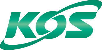
New symbol of KOS is designed to represent future-oriented global company.
The letter ‘O’ symbolizes the earth while the two lines signify wires that are leaping passionately for our advancement in the world market.
Although the green color of the symbol signifies continuous development, purity, and youth, the gradation of the colors is incorporated in order to give it metallic characteristics.
- SYMBOL (REGULAR TYPE)
-
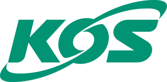
New symbol of KOS is designed to represent future-oriented global company.
The letter ‘O’ symbolizes the earth while the two lines signify wires that are leaping passionately for our advancement in the world market.
Although the green color of the symbol signifies continuous development, purity, and youth, the gradation of the colors is incorporated in order to give it metallic characteristics.
- ENGLISH LOGO (LOGO TYPE)
-

The English logo is designed to remain consistent to the KOS image, but by being more modern yet moderate in manner, it serves to aid in giving more prominent exposure to the logo.
- KOREAN LOGO (BASIC TYPE & SIMPLE TYPE)
-
Official Korean translation of the English Logo ‘KOS LTD.’ Is designed in order to give soft and friendly impression by using fonts similar to the beauty of stainless wire.
Color System

SITEMAP
팝업닫기- ESG MANAGEMENT
- KOS ESG MANAGEMENT
- KOS ESG STRATEGY
- KOS ESG REPORT
- KOS ESG NEWS
- ETHICS POLICY
- CODE OF CONDUCT
- Safety & Health Policy
- Quality Policy
- Environmental Policy
- Reporting Center for Unfair Practices
- Code of Conduct for KOS Partners
- PRODUCTS
- STAINLESS WIRE
- STAINLESS ROPE
- MEDICAL WIRE
- KOSBON
- STAINLESS FLAT WIRE
- KOSNIC
- NICKEL ALLOY-WIRE
- AEROSPACE WIRE
- PR CENTER
- E-CATALOGUE
- PR VIDEO